Showing posts with label classroom. Show all posts

Friday, November 8, 2013

Art from my classroom.


My sixth grade students are working on watercolor koi fish and while they painted today I drew and painted a few more koi myself. In only about ten minutes of course before I had to answer a question and settle a disagreement.
I am working on Stonehenge paper here that was left over from another class making accordion books, so it was folded before I drew on it (causing my washes to settle in the creases). I used a Uniball Vision Elite pen, which I assumed would be waterproof like a regular Uniball, but it is not it turns out, at all. My lines bled and blurred into my painting the longer I painted, or the longer they were wet really.  When I realized the pen wasn't waterproof and that the longer the sheet was wet the more paint that pulled out from the line, I started to try and play with the effect a bit as a way of adding value. As you can see from the photo, I am painting with classic Crayola watercolors. I have my regular Daniel Smith colors with me but I was curious what I could do with the sets in my room and they were out from my demonstration on my counter so it was easy to go from what I was doing to a little bit of play in a peaceful moment.
What I do know is that I am putting these in my bag to take home and add to a Not-So-Blank-Journal page when I get home.

Wednesday, March 14, 2012

Sketchbook Exchange - classroom edition results

This fall I had an idea to have students in my advanced drawing class exchange themed sketchbooks with each other.  The project was a huge success and a lot of fun for me (I was able to exchange too) and the students.  Our exchange project included eleven students as well as myself and spanned roughly three months.  Each participant worked one time in each of twelve journals, each journal having a theme picked by the artist who started the sketchbook.  I have photos of long stretches of these books, but seeing as there is student work involved in the exchange, I am only posting my entry in each of these books.  
The books themselves are made with Strathmore 400 series Mixed Media paper which is available in several sizes and comes in a pad rather than as single sheets.  My students and I had been using this paper in the classroom as a solid choice for work involving nearly any medium.  My students had never been exposed to a paper that was smooth and could handle pen or pencils of all sorts well but also stand up to all manor of water based mediums (gouache, watercolor, acrylic ink and paint).  This new paper experience opened up a new world of working in multiple mediums for many of them and we went through several pads of this paper on flat artwork in my classroom.  It was because of this enjoyment of the sheet that I opted to use it as the paper when I created our sketchbooks.  
As far as a paper for bookbinding I have reservations regarding the 400 series paper.  It holds up well to all mediums, with no buckling or bleed through, which is good and makes the paper enjoyable to work on and makes it seem like a good choice for binding books, however, this paper cracks at the folded edge.  Even worse, it doesn't always crack at the fold edge, so some folds are severely cracked and some edges are fine with no cracking at all.  
When I first noticed the cracking I became worried that the books were going to fall apart and this was troublesome because we had already begun our exchange and were working in the books.  Despite the cracking the paper retained its strength and none of the books broke apart, they all stayed together as one long accordion.  The crack at the fold did make some of the books harder to work in as the crack wicked any water along its length, dragging paint with it.  Sometimes a fold would crack later, after it had been worked on too, opening up a gap in the image.  It is this inconsistency and cracking that will keep me from binding anymore books with the 400 series paper.  
The following images are my own entry into a student's book.  All of the images are first drawn with a Sharpie pen and then painted in using watercolor paint (either VanGogh or Grumbacher depending on if I worked at home or in my classroom).  Very often the image then gets redrawn with the Sharpie pen to create emphasis and refine the image on the page.  I am missing photos of my images from two of the twelve books, if I can get a hold of an image I will add them as I can.
 Music themed book, the final entry after many rainbow backgrounds.
 The pond, I added the dragonfly in the space between two other entries, some cracking evident 
My sketchbook "Must have been Something I Ate"
 Night themed book, I used salt to create a starry effect
 Book theme: Oops!
You can see the impact of the cracked fold
on this image, the green bled down her face and the centerline
is obviously "empty" at her nose/mouth/chin
Nature/Human Body themed book
 Under the Sea
Abstract Mechanics
Dream
Life / Death

Saturday, February 18, 2012

Late Winter Slump

Heron painted in my classroom as an
ongoing demo on watercolor painting

Sometimes as an artist things slump.  Ideas seem stale or forced and no matter what gets tried it doesn't seem to work out well.  I feel like I have been in one of those slumps for a few weeks now.
Usually, my sketchbook has been the perfect place to stay active and drawing and at least doing something to move through the slow time in my art and for whatever reason this winter that has even been slow.
As an art teacher however, I am always making work in my classroom.  It is never fabulous and is often never finished but sometimes a demonstration manages to work out and the result is at least moderately pleasing.  It is my demonstration work that is getting finished right now.  It is getting finished because I know I am in a slump and feel as if I need to create work, even if that work is done while I explain things to my students and even if it doesn't feel fabulous at least I am creating work.  The heron painting in this post is one such example.  It began as a multi-part demonstration on page use and sketching subject matter, then laying in background and painting your subject by layering light washes of paint.  I then spent some time over a couple of days working while my students worked on their own paintings to finish.
There are places in the painting I like (feathers) and some areas I think could be better (beak & background washes)  but it feels reasonably complete and if nothing else finishing this gets me moving forward rather than pouting and stewing about nothing really singing in my studio right now.

Monday, January 23, 2012

Accordion Bound Sketchbooks

Beginning of the planning and mock-up process.
Good notes and lots of measuring all lead to a smooth book binding project.
Last winter in the MCBA gallery there was a show of Moly_x sketchbooks on display.  At the time, I decided that an exchange in an accordion bound book was a perfect collaborative project for students and filed the information away until this school year.


Paper and cover boards all cut and ready for the next step.
In early December (or maybe even late November), I began planning and prepping to create twelve accordion style journals modeled after the Moleskine Japanese folded journal. I chose to create my own books for my students to use for two reasons.  Reason one: the Moleskine paper stinks for any type of media other than pen or pencil (it also actually stinks, a funny chemical smell - yuck).  I wanted my students to be able to use any art material they wanted and not to limit their choices to dry media the way the original journal paper would.  Reason two: as a teacher purchasing twelve of these journals at once to give away to students was not in my budget, especially considering reason one.
Binding a series of books that you want to all be the same requires some preparation.  First a dummy or mock-up has to be made, usually out of similar but not the final materials being used.  This mock-up process allows a book binder the opportunity to work out any kinks in the structure and to plan out all of the needed measurements and supply requirements for one book, so that when all the books are being bound the materials can all be prepped ahead of time with nothing forgotten or overlooked.


Attaching the spine and cover boards.
As I was making my mock-up I was also trying to decide which paper best suited the needs of my students and my budget.  I decided on the Mixed Media paper (400 series) being made by Strathmore.  I had some of the large pads (18x24) on hand in my classroom already,  and my students were loving it for all sorts of work they were doing.  It is also reasonably priced, so using an entire pad of it to make twelve books was not cost prohibitive, especially since I was planning on using recycled (matt scraps for cover boards) and on hand (my own marbled paper, tape, glue etc) materials for the rest of the project.  It also seemed like a good paper choice to hold up to the accordion structure itself, being it is heavier paper and wouldn't sag or tear at the folds with repeated folding and unfolding.
After making the mock-up and deciding that my measurements were good, it was time to go into production making the twelve books.  I measured and cut all the strips of Mixed Media paper.  I then measured and made tiny marks where all of the future folds would go for when I got to that stage.  I cut all of my covers and spines using old matt board scraps from my classroom.  After the cover supplies were cut, I made a template and taping station so I could quickly and easily attach all the covers to the spines using the same spacing for each book.
A comparison  of the Moleskine book and my mock-up
using the Strathmore mixed media paper
Once the covers were set to go they had to be covered with something decorative.  I decided to use some paper that I had marbled that was hanging around in my studio at home (I always seem to have extra sheets that I have no plans for).
Unfortunately, I did not think to take any photos of the papering stage (oops).  When I papered the outside, I also attached an elastic strap to keep the books closed (the heavy paper wanted to boing the book cover up and open) and a plain sheet of paper in the back as an end sheet.  The covers dried in a press for several hours to be sure that the matt board was not going to warp from the gluing process and then the accordion pages were ready to go into the book.  I folded the paper using my pre-measured marks and a bone folder, gluing in extensions as I worked.  Each book used one full sheet of 18 x 24 paper, cut into 6 x 24 strips, causing me to have to continue the accordion by gluing small tabs from one sheet section to the next.  At that point the folded pages were glued in and all twelve books were ready to go back to my classroom for the sketchbook exchange!
As I was folding the pages for the books I noticed one small problem, this paper wants to crack a little bit at the folded edge.  It is an irregular cracking, in some sheets it is more severe than others and at this point none of the pages have ripped or become so badly cracked that I a concerned about loosing sections of the book.  But, I do know that I will not use this paper again to bind accordion structure books because the paper does crack at the fold edge.  The cracking is especially frustrating while working in the books, as sometimes it will peel a bit as it is being painted or after the work is complete causing a small bare spot to emerge.

Three of the completed books, awaiting delivery
to the next student in the exchange.
My students were very excited to be getting a book that I made for them, as well as to be starting a collaborative project with each other.  Students each picked a book that became theirs, it is the one that they will keep at the end of the exchange, and for their book they came up with a theme and then created the first entry to get their sketchbook rolling, using about the first two folds or "pages".  Students exchange books once a week, with each student adding onto the drawing before theirs using about two pages or folds and the theme that the book owner chose for their sketchbook.  It has been fun to see what the students come up with each week and to see how excited they are to see everyone's books as they progress.


Thursday, November 10, 2011

Self-portrait with textured background

 I have been working out the kinks in a new project I am having my students work on using watercolor paint, transfers, portraiture and working over a prepainted/textured background.  In the process of doing a new project, I will typically create the work myself to gain knowledge of problems they will encounter as well as to have an example of what I am expecting them to do.

For this project, students started by gathering song lyrics, poetry, and images that they could transfer (using a chartpak marker)  onto the page for some texture and hidden imagery later when the portrait was complete. I did not think ahead to photograph my work at this early stage; you can see the transfers through the paint in the image below, they are the black markings, which are actually stanzas of song lyrics and the owl face.
 After the transfers, they were told to pre-paint their paper using watercolors, using the texture technique of their choice (plastic wrap, paper towel, sponge, splatter, salt) and a cruciform page layout, using two colors either complementary or analogous.  I used a dark blue and a burnt umber for a complementary color pairing, with the intention of painting my portrait using a monochromatic color scheme using the burnt umber.
In the image below you can see my painted portrait about mid-stage on the above background.  Again, I wish I had thought to take more photos as I was working rather than when I was done for the afternoon, so my process was more completely documented now.  I began my portrait by painting in shadows using the same blue as in the background and a tiny bit of payne's gray.  Then, I began using the burnt umber and some payne's gray to continue to build a likeness.  At this stage I also used the blue again to define the edges of my shoulders so I did not just have a floating face on the page.

I had intended to have a monochromatic version of my portrait that was unified with my background color and was super surprised as I worked, that by using the burnt umber, I was in fact creating a realistically colored portrait of myself.  
(As a note: this has been a weird hang up for my students.  I am telling them to choose a color from or close to one of their background colors and paint their portrait using a monochromatic scale to follow the values in their photo/face, and then they see mine and say "but yours is real and I can't mix skin color".  To remedy this problem, I began a new portrait (using green) and I have also shown them that the colors I used (deep blue and burnt umber) mix to make a brownish color on an additional sheet of paper.  This seems to have helped and this week in class their projects are coming along beautifully.)
After I completed the portrait by adding in the eye details and adjusting some color in the eye brows, I went back and added more transfers to the background.  I found some gears and cogs, along with a few owl drawings from my sketchbook that I copied on a photocopier so the marker transfer process would work.  At this point I felt like the portrait was finished but I left it at my desk so I could look at it a couple times a day and I felt as I looked at the completed image that I needed to go back into the background one more time with a bit more of the burnt umber and expand the umber color around my head and in the top of the page.  I am hoping to make these additional changes soon, but unfortunately they have yet to happen.  
If I change the background I will add a new image but for now, know it  looks as done as the image below, and that my students are enjoying the project and that it has spread (a bit like a fun and fascinating virus) to include some advanced independent study students in another class of mine who are seeing it done and exploring the process themselves "because it looks cool".


Wednesday, November 2, 2011

Monochromatic Owl

 8x10 inches, acrylic paint on gessoed canvas
In the painting class I am teaching we switched gears and began working in acrylic last week.  I always love when teaching a topic takes me into territory that I do not regularly travel through, as is true with acrylic painting.
I very rarely work in acrylics and I am enjoying the change of pace and sense of experimentation that changing mediums and instructing new painters has brought me this week.
This little green owl came about as we are beginning our first actual painting using a monochromatic color scheme.  This began as a demonstration for transferring an image and beginning to assign colored values to a painting from a black and white reference image and I just had to complete the entire thing this afternoon because it was just too much fun to paint.  I may just have to do another acrylic painting, something I rarely do, just to have more fun with painting in a "new" medium.

Thursday, October 6, 2011

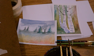
Watercolor Landscapes from my Classroom

I have been teaching a painting class this fall and we have been learning to create loose watercolor landscapes.

I have to say I really enjoyed teaching this lesson and I made a lot of little landscapes over the course of the week and a half we spent on this unit.

The focus was working quickly and layering washes to create a strong sense of distance. We also covered creating trees, clouds, and using salt to create textured ground effects.