Sunday, December 11, 2011

Mixing it Up!

9x24" sheet of white sulphite drawing paper
Mediums from left to right:
Uniball pen drawing, gouache collage stripe,
Generals "sketch wash" pencil,
Uniball pen, newspaper collage,
Gouache paint over brush pen sketch,
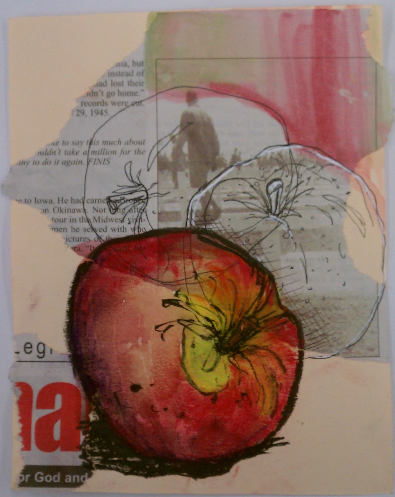
Collaged image with gouache paint addition,
gauche  and newspaper collage scraps with pen details
I spent this last Friday in my classroom demonstrating drawing (mark making) with multiple mediums for my advanced drawing students as a preparation for creating an expressive self portrait (their first project).  I had every possible art supply available for them and I worked on the small projects here as examples while they worked on their own small experiments using fruit as subjects.  

The goal was to get them to mix mark making materials and collage to create interesting and unexpected results.  Using fruit allowed them to quickly draw the subject and focus on mark making and experimenting with new mediums.  As I made discoveries I shared them and I encouraged them to do the same with each other, as sometimes what works or doesn't work is all a matter of perspective. 

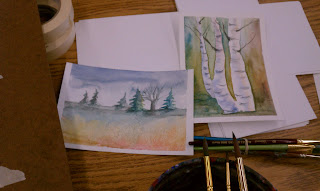
The apples were mostly examples made while discussing techniques and properties of a particular medium while students watched.  The pears in the longer piece above was what I was working on after they all got to work.  I always love working along side my students and this little project took me through the day as I continued to explore and demonstrate mixing mediums together in the same piece of work.  Students also got to see me make decisions as I moved through the work, particularly as I got the the collage portions, as before i glued anything down I had several options that I played with on the page.

Cream Canson Mi-Teintes 
approximately 5x6"
Newspaper collage, 
Sharpie pen sketch with white gel pen accent,
Brush pen sketch with watercolor wash and soft pastel detail work 

As I worked I was experimenting with the idea of using multiple views of the same object within the same drawing.  I also knew I wanted to include collage, and was trying to encourage my students to do the same, although they were more reluctant than I was to try something completely new.  As far as new to me things from Friday, I used white gel pen, gouache, and soft pastels for the first time.  

 The colored apple on the example above was sketched with the Pentel Pocket Brush Pen; then I used some watercolors to paint the apple and the background a bit; next I used some pastels to add to the shadows and stem area and finished up with some more Brush Pen.  I like the way the pastel softened and intensified the color of the quick watercolor wash.  It along with the heavy line from the Brush Pen really pulls that apple to the front and makes a focal point, which is something we talked about doing particularly when using multiple drawings together on a page.

Canson Mi-Teintes paper about 5x5"
watercolor scrap collage, 
brush pen sketch, white gel pen sketch,  gouache
I did not particularly care for the white gel pen.  It was hard to sketch with because it did not roll smoothly on the page and I had to write very slowly to get good lines on the paper.  I also feel that the collaged together colors did not work well for me and this is my least favorite from the day.  I had a student try the water soluble oil pastels on black paper and his apple on black was stunning.

Backside of the above sheet
Sharpie pen sketch with gouache
Because I did not like the side with mostly black paper, I decided to flip my sheet and explore gouache and my Pentel Pocket Brush pen on the back and I fell in love.  Fell in love with the brush pen all over again, which made me wonder why I had taken it out of my bag.  It makes such a beautiful line on the page, I used it for the rest of the day and it went back in my sketch kit.  I am also loving gouache!  It is a fun combination of watercolor washy fun and acrylic paint opacity that also holds some brush marks. I was recommending everyone try the gouache for the rest of the afternoon.

Strathmore Mixed Media paper about 5x5"
water soluble oil pastels, 
sketch-wash pencil, 
Pentel Pocket brush pen  sketch 

This apple was worked on quickly and in layers while I walked a few students through some of the different materials they had never tried before and I wish I had thought to take photos long the way because it changed three times.  I started the sketch with General's sketch-wash water soluble graphite pencil, which works just like regular pencil but you can wet it with a brush and water which creates a graphite colored wash (grey shadow under apple).  Then, I had a student pick up a box of water soluble oil pastels I found in the supply closet and wanted to know how they worked, so I tried on my apple while she watched.  They color like crayons and then with clean water and a paint brush they turn into paint.  She liked the effect and took a set to try (yeah!).  Then I experimented with black ink and a small paint brush to see if I could replicate the effect of my Pocket Brush Pen for my class, seeing as I have only mine and many of the students liked the line I was making with it.  I feel like the ink and brush drawing has much the same effect as the brush pen but it is not as convenient if you want to travel although my students liked it and many gave that a try too.
I had originally only planned one experiment day but after having so much fun Friday and after seeing how hard it is to get them out of their comfort zone, we are going to experiment for another couple of days before beginning the self portrait project. I really want unique work from them and feel that a few days playing with supplies that are new will be time well spent in terms of getting my students to create something that is fun and uniquely theirs.

Wednesday, November 30, 2011

Oranges

This week is a crazy one. Apparently sketching fruit is soothing and lends a certain calm to my afternoon (this is my third simple fruit this week).  The shapes are simple and familiar, the colors bright, and the sketch, plus painting can be done in about fifteen minutes, which doesn't add any time pressures to my already busy week.  I found today the act of stopping and sketching (plus eating the orange) gave a nice lift to my afternoon and gave me a fresh start at my task.
Go sketch.  Trust me, it will feel good.

Tuesday, November 29, 2011

Everyday Object


Sometimes it is all about taking a twenty minute sketch break after grocery shopping. As I unpacked my produce I realized it had been far to long since I just sat down and enjoyed something because it was beautiful.  And I can not think of a better way to enjoy beauty than to look at it close enough to make a sketch. 
A simple sketch, done quick and my whole afternoon was better.  I love when that happens.

Sketch in sharpie marker (fine point), Grumbacher watercolor wash, handmade sketchbook (Rives light).  Twenty minutes well spent.  Sketch something - today!

Thursday, November 10, 2011

Self-portrait with textured background

 I have been working out the kinks in a new project I am having my students work on using watercolor paint, transfers, portraiture and working over a prepainted/textured background.  In the process of doing a new project, I will typically create the work myself to gain knowledge of problems they will encounter as well as to have an example of what I am expecting them to do.

For this project, students started by gathering song lyrics, poetry, and images that they could transfer (using a chartpak marker)  onto the page for some texture and hidden imagery later when the portrait was complete. I did not think ahead to photograph my work at this early stage; you can see the transfers through the paint in the image below, they are the black markings, which are actually stanzas of song lyrics and the owl face.
 After the transfers, they were told to pre-paint their paper using watercolors, using the texture technique of their choice (plastic wrap, paper towel, sponge, splatter, salt) and a cruciform page layout, using two colors either complementary or analogous.  I used a dark blue and a burnt umber for a complementary color pairing, with the intention of painting my portrait using a monochromatic color scheme using the burnt umber.
In the image below you can see my painted portrait about mid-stage on the above background.  Again, I wish I had thought to take more photos as I was working rather than when I was done for the afternoon, so my process was more completely documented now.  I began my portrait by painting in shadows using the same blue as in the background and a tiny bit of payne's gray.  Then, I began using the burnt umber and some payne's gray to continue to build a likeness.  At this stage I also used the blue again to define the edges of my shoulders so I did not just have a floating face on the page.

I had intended to have a monochromatic version of my portrait that was unified with my background color and was super surprised as I worked, that by using the burnt umber, I was in fact creating a realistically colored portrait of myself.  
(As a note: this has been a weird hang up for my students.  I am telling them to choose a color from or close to one of their background colors and paint their portrait using a monochromatic scale to follow the values in their photo/face, and then they see mine and say "but yours is real and I can't mix skin color".  To remedy this problem, I began a new portrait (using green) and I have also shown them that the colors I used (deep blue and burnt umber) mix to make a brownish color on an additional sheet of paper.  This seems to have helped and this week in class their projects are coming along beautifully.)
After I completed the portrait by adding in the eye details and adjusting some color in the eye brows, I went back and added more transfers to the background.  I found some gears and cogs, along with a few owl drawings from my sketchbook that I copied on a photocopier so the marker transfer process would work.  At this point I felt like the portrait was finished but I left it at my desk so I could look at it a couple times a day and I felt as I looked at the completed image that I needed to go back into the background one more time with a bit more of the burnt umber and expand the umber color around my head and in the top of the page.  I am hoping to make these additional changes soon, but unfortunately they have yet to happen.  
If I change the background I will add a new image but for now, know it  looks as done as the image below, and that my students are enjoying the project and that it has spread (a bit like a fun and fascinating virus) to include some advanced independent study students in another class of mine who are seeing it done and exploring the process themselves "because it looks cool".


Wednesday, November 9, 2011

Owls on my mind


So lately I keep drawing owls; they just keep coming up in my work. Maybe it is because we have a pair of owls in our yard and I frequently see and hear them or maybe it is because they are really beautiful and interesting birds. Who knows.
I have decided that I am going to use them to create an Artist book to enter into the "Foot in the Door 4" show at the Minneapolis Institute of Art.
This owl is a charcoal drawing I did in my classroom while my students worked the other day and I think will become part of the book. As I work I will try to post bits and parts.

~ A tiny note . . .  
This post is from two years ago in November and has moved itself to here after I edited through some old draft posts.  Strange, but not worth deleting the post - just know it is old and has reposted itself fresh.

Sunday, November 6, 2011

Adventures in Screen Printing


I have donated my time and art work to complete a month in the upcoming calendar fundraiser for MCBA.  For the last two weekends I have been printing little February pages using my Yudu screen printer, not without some trails and tribulations of course.  The system works really well, once you have the 220 mesh screen (it comes with 100 mesh, not made for detailed images), if you use Speedball ink (I also tried the Golden silkscreen medium and I avoided the Yudu ink as it has gotten some rotten reviews online and I was working on paper), and when you buy a new squeegee (the one it comes with is hard plastic with no rubber edge).  I also discovered today that I prefer to use the screen taped on my table rather than in the awkward, stiff hinged top of the system itself.  
I think I may finally have one hundred clean prints and can move on to the next project, both with the screen printer because now I have the hang of it, and in my studio as currently every flat surface is covered with drying pages and it will be a relief to stack everything up and drop the pages off to become a part of the 2012 MCBA calendar. 


Wednesday, November 2, 2011

Monochromatic Owl

 8x10 inches, acrylic paint on gessoed canvas
In the painting class I am teaching we switched gears and began working in acrylic last week.  I always love when teaching a topic takes me into territory that I do not regularly travel through, as is true with acrylic painting.
I very rarely work in acrylics and I am enjoying the change of pace and sense of experimentation that changing mediums and instructing new painters has brought me this week.
This little green owl came about as we are beginning our first actual painting using a monochromatic color scheme.  This began as a demonstration for transferring an image and beginning to assign colored values to a painting from a black and white reference image and I just had to complete the entire thing this afternoon because it was just too much fun to paint.  I may just have to do another acrylic painting, something I rarely do, just to have more fun with painting in a "new" medium.

Wednesday, October 19, 2011

Book Binding Adventures


I made this simple journal (about 7x7) by using up some recycling I had laying around in my studio and a few sheets of Rives light in cream that I wanted to try out for journaling.  For the recycled bits I used some cardboard packing material from some books that I ordered and the brown kraft paper that was around my paper purchase from a local art supply store.  The brown paper was then marbled to give it a decorative feel.  It is bound together using a basic pamphlet stitch with three signatures that were stitched through the spine, leaving the stitches exposed on the outside.
All in all it was been a nice little journal that cost me nearly nothing to make, as the only thing I really purchased was the paper inside.  It also let me try a new paper in a fun way, as I got to experiment on it in my journal as I worked my way through the book.  I liked the paper but will continue to look for one I like better before I bind up a bunch of journals.  Or really what I am more likely to do is bind several more small books with all of the varied paper I have on hand in my studio and decide from there if there is even such a thing as a completely perfect paper.

Collage Night at MCBA

My collaged spread from Monday night's meeting.

The Monday night meeting of the MCBA Visual Journal Collective with Roz Stendahl was themed "Collage". Participants were encouraged to bring sketches on loose paper, ephemera, and decorative paper along with a glue stick and scissors to try out some collage techniques in their journals.
Knowing that our meeting was about collage, I had done two quick sketches on loose paper that afternoon of some random stuff I had seen (apples while on the phone, a bird started from out the window and finished with a reference photo on my computer). I also gathered some painted paper from a paper test (Aquabee Super Deluxe paper) and a whole pile of other stuff like maps, photocopies of sketches, paste paper scraps, marbled scraps, etc.
After a brief intro on some collage techniques by Roz, the thirty or so people that turned up for the meeting got into our evening of collage creation.
I have to say that a rarely collage in my journal but I enjoyed putting two random sketches done on loose paper down into my journal when they may have just ended up in the trash or floundering in a drawer in my studio. It also caused me to think about all the times during the day that I show a student how to shade or draw something on a small scrap of drawing paper and that I tend to throw them out at the end of the day. I think I may just start saving all those random little drawings, and collage them into my journal from now on. It could be interesting.

Thursday, October 6, 2011

Watercolor Landscapes from my Classroom

I have been teaching a painting class this fall and we have been learning to create loose watercolor landscapes.

I have to say I really enjoyed teaching this lesson and I made a lot of little landscapes over the course of the week and a half we spent on this unit.

The focus was working quickly and layering washes to create a strong sense of distance. We also covered creating trees, clouds, and using salt to create textured ground effects.

Sunday, August 28, 2011

MN State Fair Sketch-out

sleeping pig - full spread about 7x14 inches
on Rives lightweight in cream,
sketched with Sharpie pen,
Grumbacher watercolor added
Last Saturday I was at the Minnesota State Fair with a group of about eleven people from the MCBA Visual Journal Collective for a sketch-out. We had a lovely day drawing amongst the thousands of visitors to the fair. We met as a group at one and four so we could chat about our adventures drawing at such a large public event as well as to share our work with one another.

My first sketch - trying to catch the
crowds and booths along a street
brown Pitt pen
I began my day drawing just using a brown (sepia) Pitt pen. I was trying to draw fast and catch a sense of the crowds, buildings, and booths that line the streets of the fair. I have to say that was challenging and I moved on to drawing the livestock in the barns instead.

The cow barn- brown Pitt pen
The animals are always enjoyable to draw at the fair and I got a handful of drawings in before the first meeting was scheduled. After we met as a group, I inadvertently switched pens. I had been using a sepia Pitt pen and I grabbed my black Sharpie pen instead - no big deal just something I noticed later when I looked at my sketches from the day.
After the break, I also switched it up and decided to try my hand at adding paint to my sketches on site. If I am going to add color I very often add it at home after the fact, but so many sketchers had beautifully painted pages from that morning I decided to try and paint too. That is the great thing about seeing someone else's work, it can push you to try something new.

Little sheep - Sharpie pen,
Grumbacher watercolor,
my favorite from the day.
The sheep was my first attempt at adding color on the spot. I was happy it worked out to paint as I sketched in the barn using my travel set and a Niji brush, so I continued to add color to the remainder of my pages. (The pig at the top of the post came after the sheep.)
After the pig and sheep, I took a sketching break and walked across the fair to see the fine art building and other sights. After walking back and arriving at our meeting place for the afternoon, I sat and sketched while talking to Marty Harris, a fellow sketcher at the fair. I was sketching a group of five boys that all had on green shirts but they got up before I finished the whole group - I got two and they were the last sketch I did that day.
I feel like I had a great day, I pushed myself to try something new and got to get out and spend the day drawing. What could be better?

Two boys - my last sketch of the day
done while talking with another sketcher and
waiting for the rest of the group.
Sharpie pen, Grumbacher watercolor

Wednesday, August 3, 2011

At Guitar Lessons


Sketch done in Stonehenge journal with
a brown Pitt Pen, size S.
My daughter takes guitar lessons at American Guitar and Band. The shop/studio has a lot of great guitars to draw as well as some unusual elements (such as this huge skull) on the walls. While I wait for her half hour lesson, I draw stuff and sometimes people in the store.
The staff is starting to be used to me standing around and drawing stuff, which is good, I don't have to stop as often to answer questions or tell them I don't really need help with anything.

Half an hour might not seem like that long to draw but it is amazing what you can draw in that time. The skull drawing was my only drawing for that day, so it was a full 30 minute sketch. Usually, I do a couple of quicker sketches while I am there, either combined on one page or on separate pages, depending on size.
Stonehenge journal, Sharpie pen fine tip.
This page with two images done on the same lesson day, a different day from the skull, is an example with quicker sketches combined on a page. My plan was to draw the full display of vintage, signed guitars above the store owner's desk. My attempt at beginning this is in the lower left corner.
When my plan to draw guitars was unsuccessful, I sat back down in the waiting area. I was going to put my book away and just wait, because I was frustrated with how my drawing had turned out. At that point, the next student for lessons came in and sat on the other end of the bench. He was early for his lesson, so took out his guitar to play and I decided to sketch him while he played. This sketch of the guitar player was quick, maybe ten minutes, and done in stealth mode (he was sitting less than an arm's length away). I was happy with the sketch and it shows that I always need to push for just one more after I get frustrated sketching.
Now sometimes people ask, "what do you do with all of your sketches?" or "what is the point?". Most of my sketches do just sit in the sketchbooks they are drawn in, on a shelf in my studio. The point - they are for me. They help me focus my mind and see the world around me in a way that is uniquely mine. For me there is no other point needed. There is one other amazing advantage to keeping a sketchbook and working from life - having sketches to use in other artwork. Because the drawing was my work to begin with, I do not have to worry about copyright or changing something so it becomes mine, it is my work in the first place, so I can use it as I see fit.
The guitar player sketch, is a simple example of that idea come to life. I am involved in a sketchbook exchange with several other artists from around the world. For my entry into one of their books I needed to come up with a drawing that had a musical theme. I thought of my little guitar player sketch right away. I got out that sketchbook and used my light table to trace the sketch out of the book and onto the other paper and then added other more abstract elements and paint to complete a more finished piece of artwork from the quick sketch done in my sketchbook.
Artwork done on Arches hot press
90 lb paper, drawing in Sharpie pen,
with Grumbacher watercolor -
approximate size 8 x 11 inches
Now, if I had left my book in my bag and skipped the sketch because my first one had failed, I wouldn't have had the image for reference. I may have remembered the moment and wanted to use the idea but instead of having my own sketch to use I might have been tempted to find a picture online. Sometimes that seems like the easy option but it is always important to remember that the image you find online to use isn't yours to use. It is one of the many reasons that I sketch or snap my own picture - the image is mine to use in my work. No toes stepped on, no one else's art "borrowed" so I can make mine.

Monday, July 11, 2011

Virtual Paintout - Island of Jersey (United Kingdom)


Sketch in pen, watercolor added,
in a Stonehenge journal - 7x14 inches
This month's Virtual Paintout location is the island of Jersey. Now when I first saw the location I admit I was confused as to where Jersey was exactly. So I had to look at a big map and discovered that Jersey is an island off the coast of Northern France that is actually a part of the United Kingdom. I learned something new.

A map of the coast of France,
Jersey is the lower of the two
islands near the coast.

My sketch is of the La Rue des Cateaux, a random stretch of wooded road that I thought looked sort of tranquil yet mysterious at the same time; especially looking to the dark tunnel the tree lined road creates at the edge of the view.
Sketch is in my current journal, Stonehenge 7x7 inches. Originally drawn in pen (brown Pitt) and then watercolor (Grumbacher) added.

Wednesday, July 6, 2011

A Trip to the Farmer's Market

Sketch done at home with veggies purchased at the market.
Stonehenge journal, brown Pitt pen, Grumbacher watercolor.

This morning I went to the Minneapolis Farmer's Market to draw and paint as well as pick up some fresh veggies and flowers. I met up with a group of watercolor painters from the Northstar Watercolor Society, they scheduled to be there for a weekly paint-out they have set up for the summer on Wednesday mornings (see the list of locations for the remainder of the summer here). The paint-outs they have set up are for anyone, members and newbies alike.

Sketches done at the market.
Stonehenge journal, brown Pitt pen, Grumbacher watercolor.
I had fun, which is always important. One thing I did notice was that the group from the watercolor society did not travel light. They had large palettes, easels, stools, buckets of water, etc. I have gotten used to traveling light, my small paint set, a niji brush, just my 8x8 sketchbook, all in my purse, and it was really a surprise to see all the gear they brought along for a three hour paint-out. Nothing against their gear, but I kind of like my lighter travel version better. It means I can always have a paint-out, no set-up required.


Friday, July 1, 2011

Trying for Daily

I have been trying to get into a daily sketching habit over my summer break, with the hopes that it will hang on through the entire year. Don't get me wrong I draw fairly regularly but I am trying to get better about using my journal as a daily drawing break. So far I have been doing quite well with getting in at least one drawing a day, sometimes even more. It really helps that I have gotten a purse big enough to hold my sketch book and a small sketch set, so no matter where I go I have my stuff and if I can take a break for even just a ten minute sketch I am grabbing the opportunity.
This sketch is from this morning over coffee, watching my cat Izzy sleep on the chair across the room from me. She sleeps here for about an hour every morning, today I took the time to fully record it in paint on paper. Her gray fluff makes for great contrast from the red chair.

Sketch done in Pitt pen (brown, my current favorite) in a Stonehenge paper journal (which pilled a little on the chair back as I worked), with Daniel Smith and Grumbacher watercolors.

Thursday, June 30, 2011

June Virtual Paintout


The June Virtual Paintout location was New Zealand. I had to get in this month! Finished in my current skecthbook on the last day.
Sketch done in a Stonehenge journal with a PITT pen (size S/brown) and Grumbacher artist watercolors.

Tuesday, June 21, 2011

Studio Remodel

On Thursday of last week I began cleaning and putting my studio back together after borrowing the portable table I use as my studio work table for a garage sale. Rather than put the removable table back into my studio and potentailly have to repeat the putting it all together again process (as I have done before - a removable table is too useful), I began to look for an inexpensive and easy way to create new permanent tables for my studio space.
I decided that flush doors and some cheap assemble-it-yourself bookcases might just be the ticket. I measured for height and length, priced out book cases, and went shopping for doors on Friday. I scored doors for super cheap ($2) and the bookcases were on sale, let the remodel begin.
Studio before picture.

On Sunday my hubby helped out and we decided that two tables, one desk height (built with 2x4s), and the other counter height (on the bookcases), along with a new eight foot natural daylight flurescent fixture (previously had a bare 100 watt bulb) rounded out the room nicely.

Studio after picture.
So, after one day shopping (total remodel under $100), one day emptying, one day building, and one day reorganizing and putting things away, I have a new studio space to work in.
Yippee!

Wednesday, June 15, 2011

A Sketchbook Story - Part Two: The Review


In April of 2010 I purchased and began to use a Aquabee Super Deluxe sketchbook for the first time. The reasons behind this purchase and decision factors that lead to the purchase of this book you can see my post here.
The book itself is a 9x9 inch square, spiral bound with 60 sheets of 93 lb. (150 gsm) smooth, white paper. It has a heavy board back and a lighter weight burgundy, sort of faux leather texture, front cover. The cover has held up very well, it has not ripped at the binding wire and it hasn't lost it's color or gotten overly damaged over the course of filling the book. I have had some sketchbooks loose the cover piece fairly quick as it has not been a very sturdy sheet of paper. This cover is sort of coated and shiny and has lasted well, although it would not be easy to personalize because of the plastic coating and embossed lettering of the label.
The square shape available through Aquabee was one of the reasons I looked at this book in the first place. I really like square books, and the 9 inch size seemed big enough in terms of page size but still small enough to fit into a reasonably sized bag for on the go sketching. Because I had always used smaller books (5x7), this book seemed very large to me in terms of page acreage at first. It did get used the the size and in fact miss it a bit after moving back to a smaller journal.
An end view, there is some bulging
at the edge when compared to
a journal with no wet media used, but not a ton.

The paper was another factor in choosing this book. The paper is advertised on the cover of the book as being "heavyweight drawing paper, for use with wet & dry media" with a "classic natural white sheet and textured surface with excellent tooth". I was looking for a book that could handle wet media and collage without bleed through or a lot of buckle, so the advertised paper seemed perfect for my sketching needs.
A view of some show through on a page,
if you look closely you can se a pair of peppers above the pairs.

I would describe this paper as being fairly smooth, with nearly no texture on the surface of the paper. The front side of the sheets does have a subtle tooth when compared to the back side of the sheet which is very smooth. When working in the book the front to back difference in texture was unnoticeable, I am only noticing now because I am looking for tiny details. The paper was as advertised, good for both wet and dry media.
Above - sketch with a Pentel brush pen.
Below - sketch with a Sharpie pen and added
watercolor pencil wash to outer edge.
Over the course of filling this journal I used: pen (usually Sharpie pen but occasionally a micron or brush pen), markers, watercolor, acrylic, collage (with gluestick, PVA, and gel medium), colored pencil, watercolor pencil, and Chartpak marker transfer.
All sketching on this page done with Pitt
artist pen brush tipped markers.
I never used any of these mediums and said to myself, "Wow, that was bad on this paper". The paper held up, with very little buckle, with no bleed through (I always used both sides of the sheet) and only the rare instance of show through (se image of the pears above), which again is only really noticeable because I am being hyper aware of characteristics.

An example of the heavy nature of the paper.
These pages are back to back, tomato on one side of the page,
my internal critic on the other. Even though both pages
are very saturated with watercolor, there is no
indication of the image on the other side with either image.
While working on pages I typically sketch in pen and then go back when the sketch is complete and add watercolor. The ink dried quickly on this paper and I never experienced any sort of pen bleed when the ink was exposed to the water and brush of the paint.
On occasion I did scrub with my brush a bit on the page, to lift color or just as a part of the process of adding one wet wash over the next fairly quickly while adding color. The paper does not pill or scrub apart like some papers can under that type of use.
A page that has Golden liquid acrylic background painting,
gel medium collage, and glued in elements.
The only buckle comes from the marbled paper scraps on the right,
mostly due to the heavier weight of the paper scraps.
The paper also held up well to different types of collage, without buckling the page or altering the journal too much. The addition of collage materials, a couple of now double pages, one extra page, and two added pockets may actually explain the slight bulging at the fore edge of the completed journal (image of bulged edge earlier in post).
Above - text is transferred in using Chartpak marker,
remainder of the page uses both Golden liquid acrylics
and regular acrylic paints.
Below - image began as a watercolor sketch but the paint was
beading up where the paper had been touched by my
freshly lotioned hands (not good for painting). I then tried
to save the page by finishing the image using colored pencils.
All in all the Aquabee Super Deluxe is a sturdy sketchbook with a nice heavy duty paper that held up to everything I could think to put between it's covers and on it's pages. I have no complaints and had no problems with the book or the paper it contained.
I would buy this sketchbook again (am planning on it actually) and recommend the book to anyone looking for a sturdy, medium flexible sketchbook or journal.

Tuesday, June 14, 2011

A Sketchbook Story - Part One

Over the course of the last two years I have made a concentrated effort to be more consistent with my own art making. As a part of that effort I began using a sketchbook/visual journal. I have always used a journal/sketchbook for work (art teacher), it has helped me keep track of ideas for new projects, make lists that I can find later, and contained the occasional sketch or doodle from meetings or down time. For these books I have always used a 5x7 spiral bound sketchbook containing lightweight drawing paper. I have never been fussy about brand, just the size and that the paper had no lines. In the last couple of years I have gone through several of these books, some with no brand indicator, my most recent was a Canson.
Journal on the left from 2008 unknown type;
most recent journal from 2010 on the right
Don't get me wrong, I love these books, they are inexpensive, readily available, and very portable. But in January 2010 I began attending the MCBA Visual Journal Collective. I started to go to these monthly meetings to meet other artists and to help me jump start the effort I was making to make more personal artwork and I was inspired.
I was inspired by the fabulous and varied approaches to keeping a sketchbook/journal but I was also inspired to begin using color. I have always preferred to draw directly with pen, less thought about right (erasing), equals more drawing, which tends to yield better drawings. But color was a new idea for my sketchbook, one I had never really explored. Oh, I have colorful pages in my early journals, done with markers, or with colored pencils or occasionally with collage, but it was never anything I used regularly. So the idea of adding color was a fresh one.
Journal image from 2008 using marker (above)
Journal image from 2010 (below) in colored pencil
I tried a couple of pages at home after those first couple of meetings using colored pencils. I loved the results, but the time it took and the need to try and hold multiple pencils, a sharpener, and a sketchbook meant that a table was needed and when I wanted to be able to add color on the go, colored pencils just did not seem practical.
Journal image from 2010 colored pencil
notice the buckling from the glue used to add image to the page;
it's from a painting on the other side and the glue.
Next I tried watercolor. Ah-ha! I loved this method of including color. A quick wash could be laid down before or after a drawing, and it could be drawn over again with pen for more details. Perfect, easy to do and fast. Problem . . . the paper in my sketchbook is not designed to hold water. The pages buckle and the paint pools causing pages to take forever to dry and leaving unpredictable results. These problems send me out looking for a new sketchbook for the first time in years.
As I start my search I know a couple of things already. One: I like a spiral binding. It lays flat, expands easily with collage materials, and doesn't usually come unbound. Two: I need a paper that will hold up to wet media with no bleed through and to collage without a lot of buckle. Three: I want a little bit bigger size than the one I have been using without losing easy portability.
So, it is off to Wet Paint to look for sketchbooks (I have already been to Michael's but we know how well that goes), not only is this the store everyone talks about, but I have no proper art store in the North Metro (see previous comment). After some agonizing and much looking at available books and debating on paper weight and characteristics, I choose the 9x9 Aquabee Super Deluxe.
Of course I get it home and am terrified of ruining it and I continue to try and use my other journal, unhappily. I do slowly begin to work in the book, for some reason I skip the first page (it is still blank), like that makes it better to begin. (first completed page) But at first this book feels serious to me, like I can only do "real" sketches inside of it, like it is too nice for notes or doodles or "bad" drawings. It helps when I take it to a Visual Journal Collective meeting. I take notes on the speaker; I sketch the botanicals (that night's theme). These pages are just as "real"as a "good" sketch. So my new sketchbook is broken in and I am using it and really liking the paper and gradually getting used to having more space. I am beginning to gain confidence and a willingness to experiment rather than having all my pages look perfect. This is my sketchbook after-all, the place to play and experiment and record my life on paper, for me not for anyone else.
The book is now full and I am two journals past it (both different types), but I am nearly ready for another new sketchbook and I am thinking I'll be going out to get a new Aquabee. I really liked the paper, the size, and how it handled both wet media and collage. I am preparing a review of the book, but thinking about a review made me think about why I bought it, and it felt like my review needed a precursor.
Tune in tomorrow - I give my thoughts on the book and compare it it the others I have used this year.